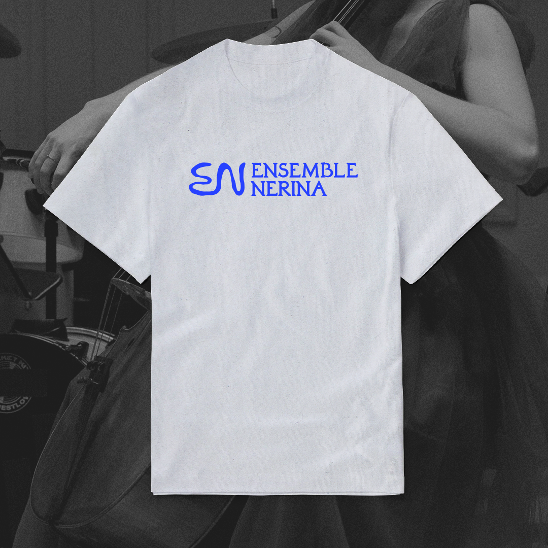
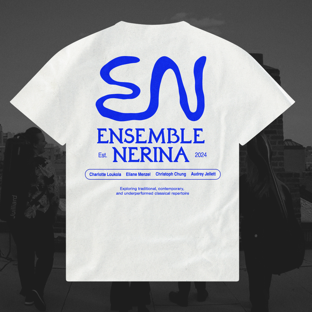
↳ Ensemble Nerina [2025]
For this freelance project, I created the logo and brand identity for Ensemble Nerina, a string quartet whose name means “ocean.” Their name reflects how each member comes from a different part of the world. To bring that theme forward, I developed an illustrative typographic logomark by tracing real water refractions and translating their forms.


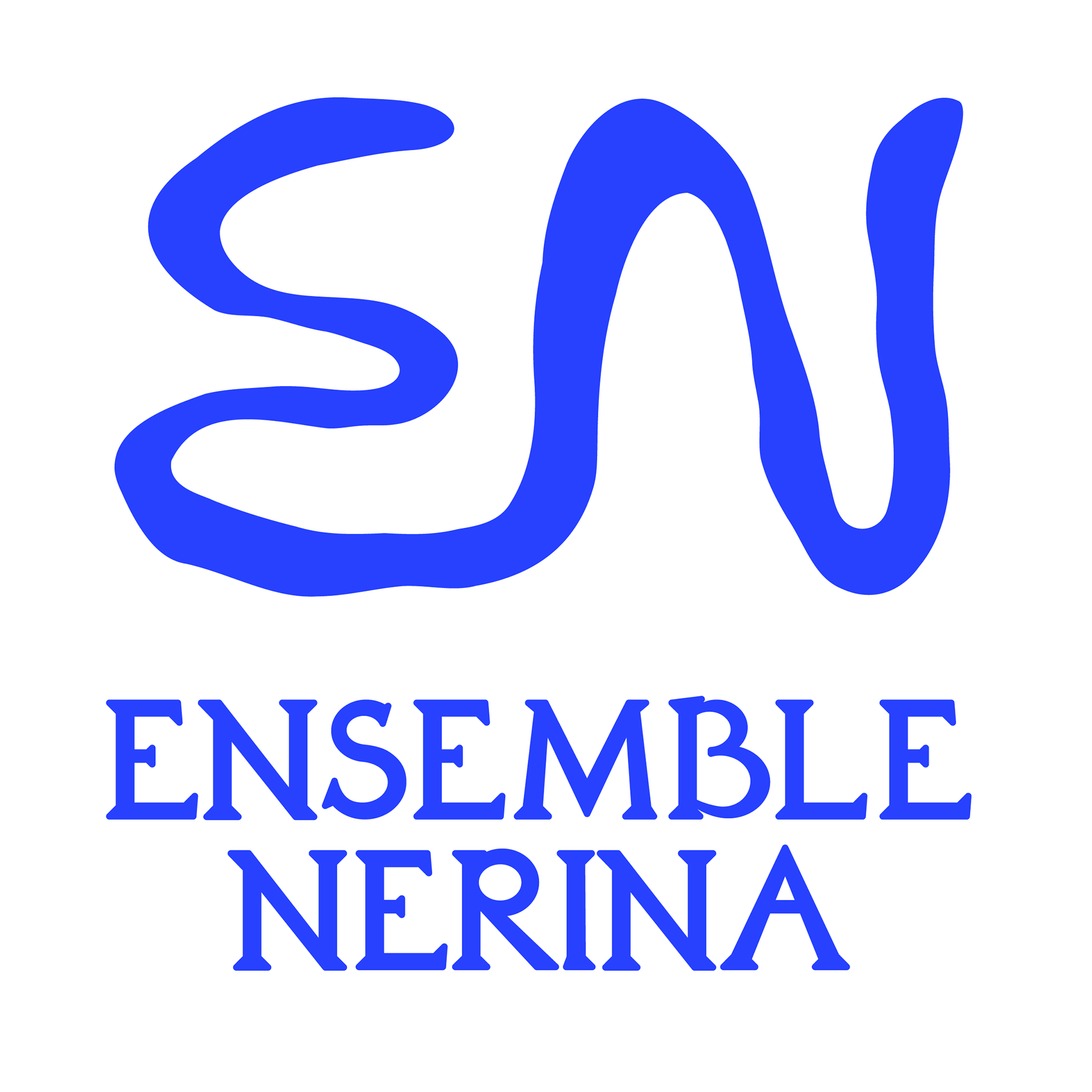
Logos in varied colorways
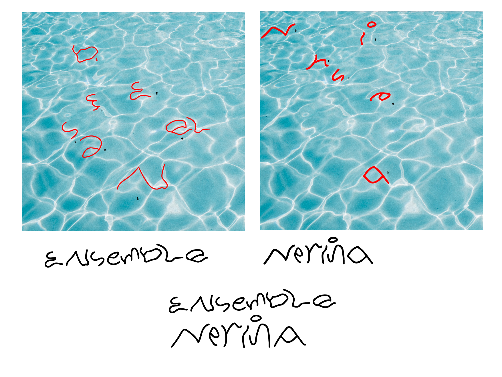

Process of creating water-refraction letters

Type / logo explanation